The Segregation Model | Models within Paper | Varying the Agents Preferences
- Source Code for Basic Segregation model (729 KB)
- Shapefile (5 KB)
In this model as with Schelling’s (1971) original model, agents only have preferences for their own group. It is this preference that causes agents to seek different areas in the city. Clarke (1991) provides some empirical evidence to support Schelling’s abstract formulations, based on the fact that neither Black nor White households in several American cities would relocate into areas where they are the minority. However, in his work, preferences for specific composition of a neighbourhood varied among cities. This section will therefore explore how the degree of segregation changes due to different preferences and explore how the preferences of individuals for their own group influence the degree of segregation seen within an area (preferences for other groups can be explored in Preferences for Both).
The only model parameters that changed within the model were the agents’ preferences for the percentage of the same type to be located within its neighbourhood. Agents are satisfied within area if their preferences are achieved as reflected in the pseudo-code in Figure 1 (and see evaluateAndSetHappiness method in Resident Class). When calculating this satisfaction, the agents do not count themselves within the process. Within these simulations the world the agents occupy is a 1.5km by 1.5km square polygon which could be considered as representing a cityscape. One could imagine this as the checkerboard that Schelling originally used. However, neither agents’ neighbourhoods nor its movement was restricted to a cell-based environment and multiple agents can occupy one area. As with Schelling’s original model, we have equal numbers of two types of agents, 2000 of each colour placed randomly within the area.
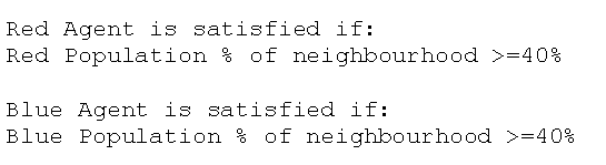
Figure 1: Pseudo-code for basic rule for an agent to be satisfied.
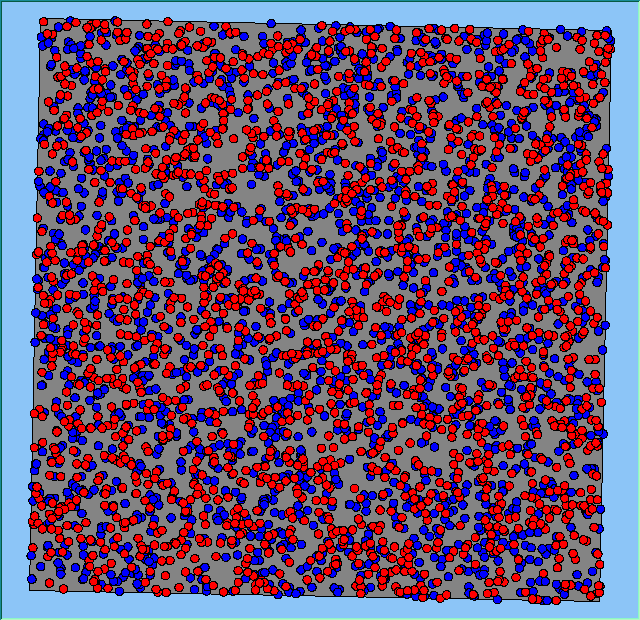
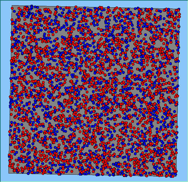
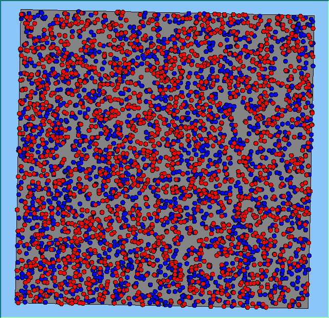
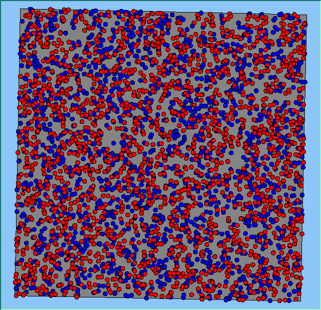
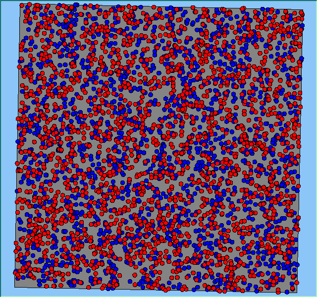
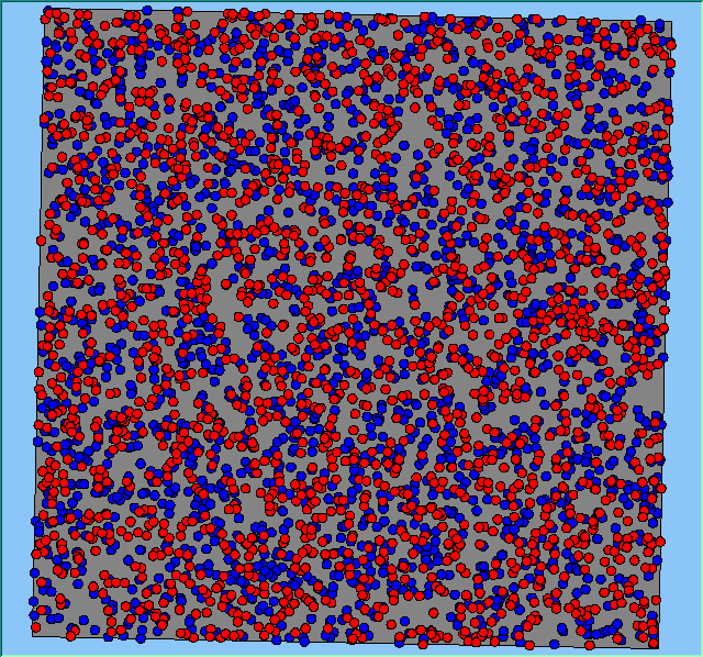
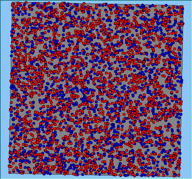
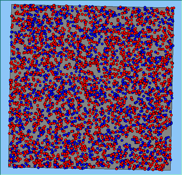
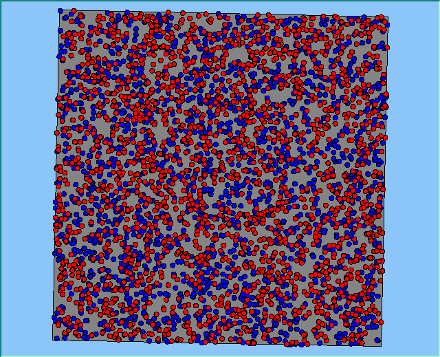
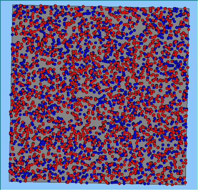
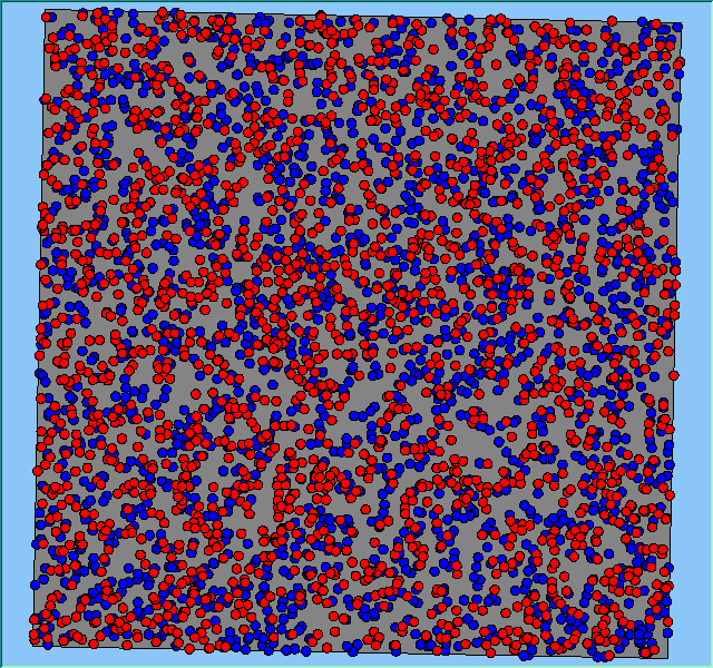
Figure 2 highlights the typical patterns of segregation that emerge from different preferences for neighbourhood composition. Animations of these simulation runs can be seen below. As the percentage of neighbours of the same type increases, the pattern of segregation becomes more noticeable. It is only when preferences become too high (>= 80%) that agents are forced to leave the system as a result of their preferences being unable to be matched (Table 1). Not all the agents are removed for as the system becomes less populated, the number of agents in different neighbourhoods change. Where agents have been removed from the system, this removal only happens in the first iteration and for the first agents that move, as these agents are unable to find a suitable neighbourhood due to the initial random placement and mixed neighbourhoods at the start of the simulation. As these agents are removed, the area becomes less populated and the resulting agents can find neighbourhoods where their preferences can be satisfied. While it is possible to add these removed agents back into the system at the end of the simulation, it was felt to be simpler to leave them out, as this reflects the idea that as an area changes, residential groups are actually excluded from those areas.
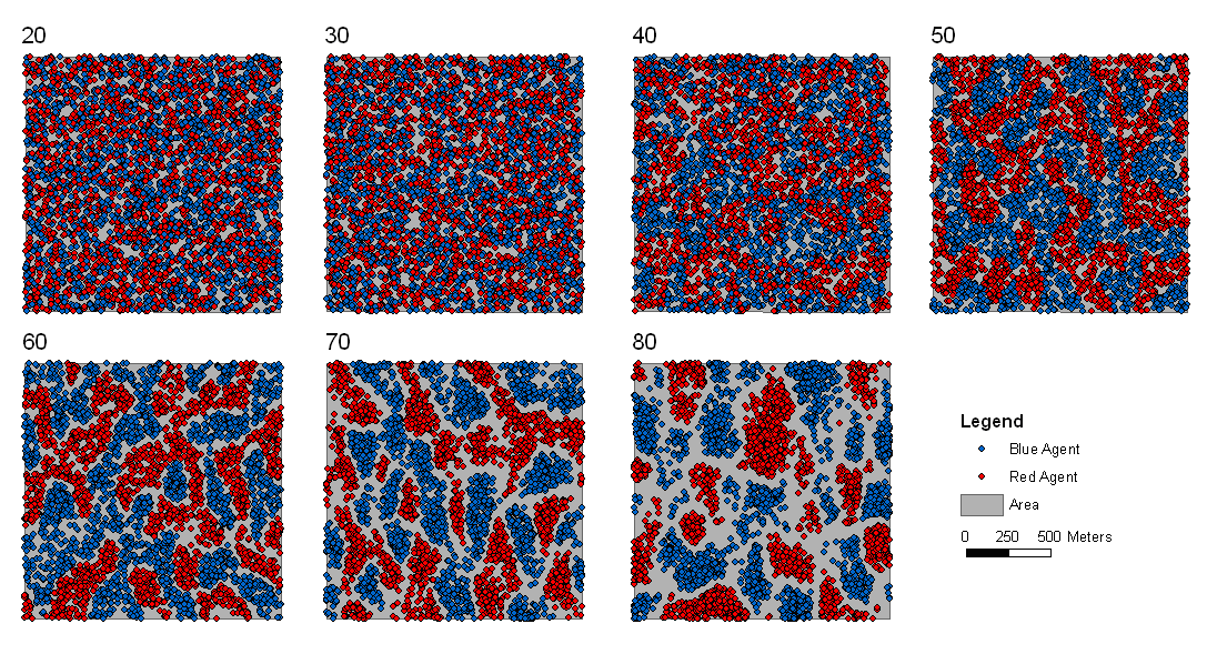
Figure 2: Typical patterns of segregation with different preferences for neighbourhood composition.
Table 1 also highlights that by increasing the percentage of neighbours of the same type within the agents’ neighbourhood, more agents are forced to move at least once during the course of a simulation. For example when preferences are low (e.g. >= 20%), little movement occurs. However, as the preference for a minimum neighbourhood increases, so does the total number of agents that moved (e.g. >= 40%) and the resulting pattern of segregation increases as highlighted in Figure 2. The frequency of movement is not often analysed on papers exploring segregation, however it is interesting to note how often agents move throughout the course of a simulation. For agents only move to areas where they are satisfied with, therefore for an agent to move more than once suggests that ‘residential-tipping’ is occurring.
Although patterns can be deceiving and it is useful to have some measure of segregation, one possible measure is the average proportion of neighbours of like or opposite colour. By counting the total number of neighbours of different types for each of the agents remaining when all are satisfied with their neighbourhood, a greater understanding of the degree of segregation can be gained. At the same time, this allows for testing if neighbourhood and preference functions in the model are working correctly.
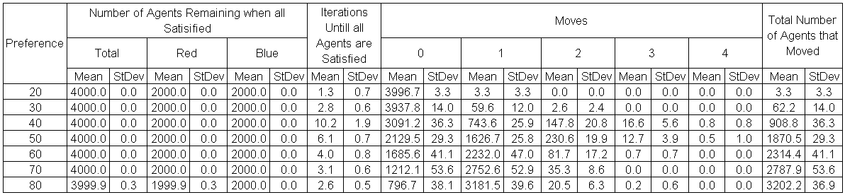
Table 1: Comparison of neighbourhood preferences and model runs.
Table 2 presents the average neighbourhood composition in terms of the percentage and number of agents at the end of each model run when all the agents have their preferences satisfied. This was calculated after the program had ended within a GIS package. As one would expect, as the agents preference for a certain composition of a neighbourhood increases and the degree to which neighbourhoods are segregated (percentage composition and number of the same type) also increases (e.g. from 40% onwards). The most noticeable variation is at 50% where the degree to which neighbourhoods are segregated rises the most.
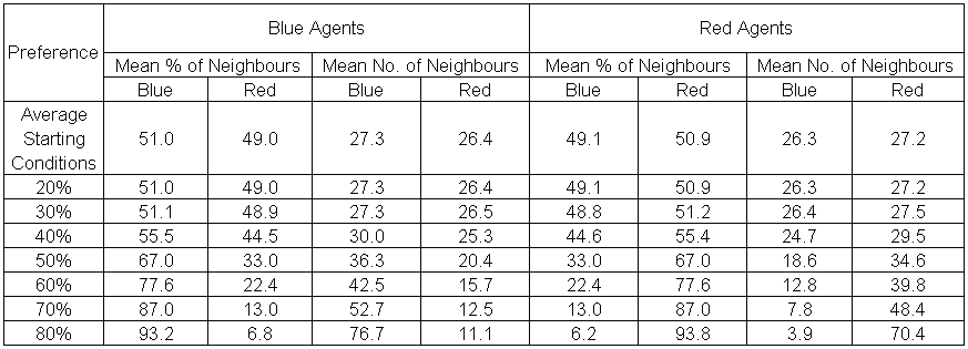
Table 2: Comparison of mean percentages of neighbourhood compositions for different preferences when all agents are satisfied.
Animations of simulation runs
 |
 |
 |
 |
 |
 |
 |
 |
 |
 |
 |
|
Typical patterns of segregation with different preferences for neighbourhood composition. |
||
References
Clark, W.A.V. (1991), 'Residential Preferences and Neighbourhood Racial Segregation: A Test of the Schelling Segregation Model', Demography, 28(1): 1-19.
Schelling, T.C. (1971), 'Dynamic Models of Segregation', Journal of Mathematical Sociology 1: 143-186.