|
Graphs and Relations in Citation
Counts
Citation counts like many organized phenomena which involve
distributions across relatively homogeneous objects, display
highly ordered structure which is said to be scaling. This
means that if you order the objects according to the frequency
with which they manifest some characteristic related to their
size, there will be a large number with a small frequency
and a small number with a large frequency. Moreover whatever
scale you do this, then a similar relationship will hold.
If you look at objects with a smaller frequency and order
these, then they will have the same relationship to each other
as objects with larger frequencies. A good example is income.
If you plot the number of people with income greater than
a certain value, then this will decrease regularly as you
raise that value. The regularity of these kind of relations
has been observed for generations but Pareto was one of the
first, in the late 19th century, to formalize it as a power
law. In essence, frequencies in such populations are not normally
distributed, if anything they are log normally distributed,
but a good approximation to their distribution is through
a power law where the frequency drops off as the number of
events gets larger.
There are many many papers on this phenomena and a good way
of looking at the scaling which is involved is to plot the
data by ranking the objects according to their size and then
plotting their size against their rank. This is called a Zipf
plot after George Kingsley Zif who popularized it for distributions
of city size and other phenomena in the 1940s. The Zipf plot
is essentially a plot of the cumulative frequency above a
certain size value where this frequency is the rank.
In the tables that accompany this analysis, we have ranked
the data according to the number of highly cited scientists
and we can thus plot these as numbers of citations against
their rank for each of the ways we have aggregated/sliced
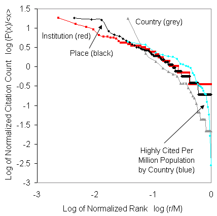
the data. There are four graphs: based on the objects as institutions,
as places, as countries, and as regions. Our thesis (which
we develop elsewhere) is that as we geographically aggregate
to greater and greater scales, the degree of concentration
increases which is reflected in the size of the negative slope
of the logarithmic transform of the Zipf plot which decreases.
We will plot the number of cited scientists P(x) normalized
by the mean <x> as P(x)/<x> against the rank of
that number r where we normalize the rank by the maximum number
of objects or events M, that is r/M. The power law is then
(P(x) / <x>) = K (r / M) ^ a
or in logarithmic form
log (P(x) / <x>)
= k - a log (r / M).
This is what we are fitting to the data below
Rank-Size
by Institution
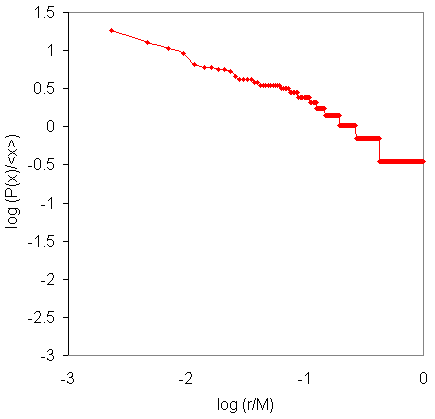
Rank-Size
by Place
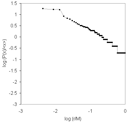
Rank-Size
by Country
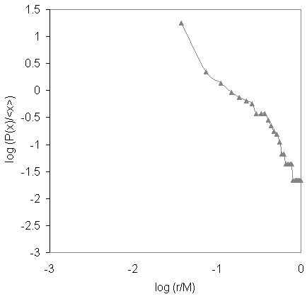
Rank-Size
by World Region
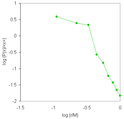
Here are all the graphs together so you can see how they
compare. Note that the way we normalize these enables them
to be collapsed onto the same plot.
|