| |
Many systems of events that show scaling in their size distributions
consist of unique events in time particularly those which
are of a physical nature such as earthquakes, craters, solar
flares and so on. The systems that we deal with in the paper
consist of non-unique objects - cities in our case - that
are fixed through time but changing in size. The problem that
pervades this kind of analysis involves the definition of
the objects in such a way that they are comparable through
time, particularly when the objects can change in their physical
area.
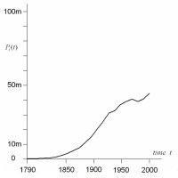
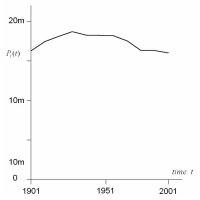
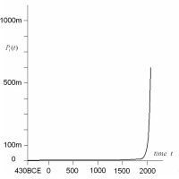
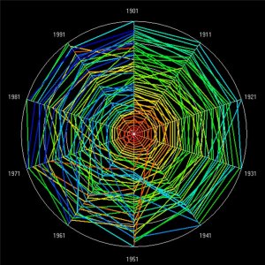
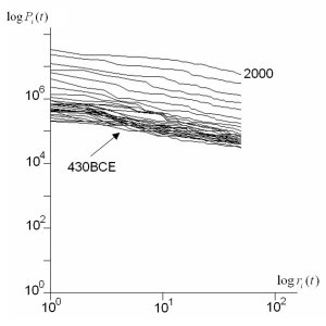
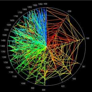
The three systems of cities that we deal with - for the US
from 1790 to 2000, for the UK from 1901 to 2001, and for the
World from 430BCE to 2000 - each define cities differently.
In the US and World examples, the area of each city varies
through time and the composition of the list of cities at
each time also varies. In the US example, the Census Bureau
who compiled the data have ensured that the cities identified
are comparable from one decade to another; in short, cities
do change by embracing their suburbs which might be defined
as individual cities in their own right in earlier eras, but
the US data set acknowledges this, consistently merging cities
through time when appropriate. The World example does not
attempt this in an explicit and controlled way. In the UK
example, the cities are fixed in area so that they are exactly
comparable from one time to another and the total number of
cities is also fixed.
These differences are minimised in the analysis in that in
each case, a smaller but fixed number of cities - 50 in total
- are identified for analysis so that all results become comparable.
Of the 266 US cities which enter the top 100 cities used in
the original data set, some 135 (or 37%) of these enter the
top 50 from 1790 to 2000. Of the 458 cities that are defined
in the UK data, 71 (or 70.4%) of these enter the top 50 cities
from 1901 to 2001. The World data set contains 390 cities
in total organised into 50 top cities for each time period
of which 12.8% appear in this list from 430BCE to 2000. These
imply substantially different kinds of city systems but they
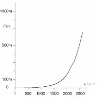
are comparable. In the panel on the right, we also plot the
total city populations for the top 50 cities for each of our
examples. The trajectories show very different patterns of
growth and change, thus making our three examples comparable
in the most interesting way.
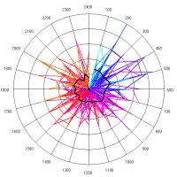
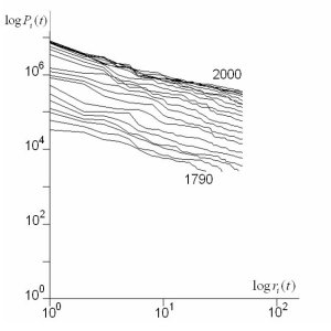
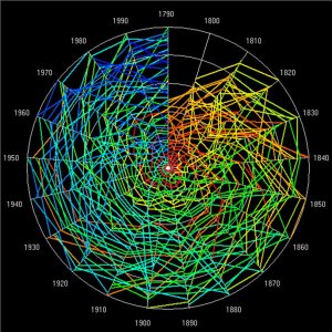
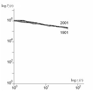
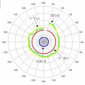
In the main paper, we did not show the Zipf plots and the
rank clocks for the US and UK systems based on the top 50
cities at each time. We now show these, but also repeat the
World system results which are based on 50 cities. This makes
the data patterns in these plots and clocks comparable. The
Zipf plots are shown below followed by the rank clocks. Readers
can also compare these plots and clocks for the 50 city ranks
to the respective full city ranks of 100 for the US and 458
for the UK systems which are in the main paper. The plots
and clocks for the 50 city systems appear to have similar
patterns to those for the full systems with a little greater
volatility in shifting ranks as the city sets are reduced.
|
|
Data
for the Top 50 Cities |
| |
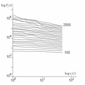
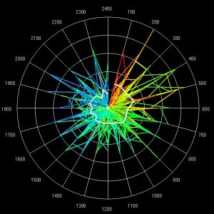
In the main paper, we do not show the plots and clocks for
the model system. The full system contains too many cities
(1500) to produce meaningful rank and distance clocks as the
visualisation is too rich (see below) although we deal with
only the top 50 of these at each time. However we show the
plots and clocks for the model results based on selecting
the top 50 cities and these are shown as a composite below.
With 1500 cities, 248 (or 21%) enter the top 50 over 2500
time steps. This is proportionately a lot less than the 12.8%
of the much smaller 390 city set that enter the top 50 World
cities, and it is consistent with the fact that there is less
volatility in the model data that in the World data. In the
panel on the right alongside the Zipf plot and clocks, we
show the growth in the total city populations. This is much
smoother than any of our three examples, illustrating classic
exponential growth in contrast to the growth in the city populations
of the World data set which is almost double exponential.
Again this indicates that the model is not able to simulate
the volatility of city growth as it has appeared in world
history, and in the massive transition beginning from Renaissance
in Europe which led to the Industrial Revolution, and the
subsequent urbanisation of the developing world.
|
| |
The clocks are so rich in detail that a full analytic appreciation
of any particular system would require the reader to explore
the plots and clocks using the relevant software. We provide
an example of this for the US system in a much stripped down
program that readers can download here if they click on the
following link. The zip file contains the program executable,
the US data file, and a short two page manual showing the
User how to run the program and explore its results. Please
note that if you download this program, keep the data file
in the same folder as the program executable. The program
should then run under the Windows Operating System but will
not run under any other. As the software has been written
under Windows XP, it may not run under different variants
and the author cannot take any responsibility for this.
|